The visual identity for Covid-19 is pretty scary. It’s often a super-condensed sans-serif typeface, all caps, in blood red. I’m pretty sure the design team went to movie posters for Outbreak and Contagion for inspiration. As much as I don’t love the Millennialification of everything via branding, I was curious about what the Covid-19 identity would look like if it was more approachable like Chobani. It’s incredible how much a few colors and typefaces can change the presentation of an idea. I’m left almost as scared of branding as I am of Covid-19.
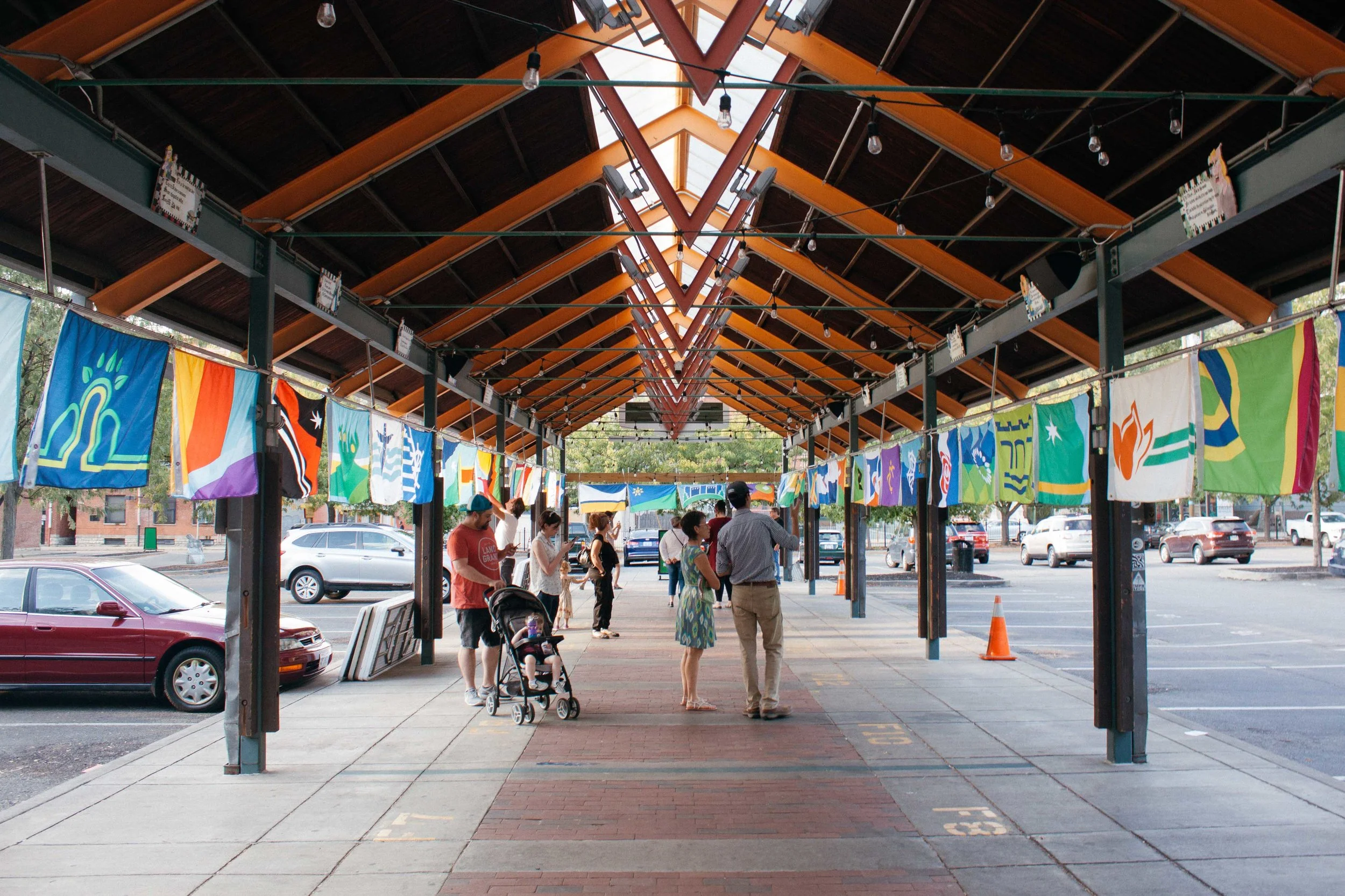
Read MoreCincyflags’ purpose was to design a flag for every neighborhood in Cincinnati. All 52 flags were revealed and displayed on Friday, September 27th, at Findlay Market. Each flag is open source and available for locals to use them as they wish. Learn more about your neighborhood’s flag at cincyflags.com.
Read MoreWhat did we learn this week?
Read MoreWhat did we learn this week?
Read More

